Landscape: Activity 5: Blog
In this landscape I took in Payson, Arizona, I used the forrest trail sign in the foreground to create a sense of depth in the background of the trees and mountains. I was trying to create an adventurous theme in this photo, like the sign points toward discovery and excitement in whatever lies beyond. I think the viewer will interpret it this way, or get a sense that the forest and wilderness is larger than life and full of possibilities.
Tuesday, November 19, 2013
Tuesday, November 12, 2013
Landscape: Activity 4: Blog
Landscape: Activity 4: Blog
1. Open Landscape
I took this photo of the Empire State building in New York city over fall break. Because the building occupies hardly any of the sky, it can be classified as an open landscape. Along with the brighter, warmer colors I tried to edit into this photo, the open sky might give the photograph a more optimistic and colorful theme to an otherwise gray and industrial area of New York.
2. Closed Landscape
I also took this picture in New York city of the famous Exchange and Broadway streets. Unlike the open landscape photo, no sky is visible, giving off the opposite effect. The theme is darker and the man made structures become more evident.
Wednesday, November 6, 2013
Landscape: Activity 3: Blog
Landscape: Activity 3: Blog
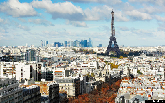
These two artistic representations of the skyline of Paris featuring the Eiffel Tower, although of the same subject matter, are very different. The top image is a painting, while the lower is a photograph. The painting features more colors, like the autumn trees and the almost golden brown siding of the building reflect warmer tones which are absent among the whites in he photograph. The clouds in the painting are also less realistic, adding an almost surreal quality to the image. So, the top image might appeal to the likes of a more idealist individual, while a realist like myself prefer the bottom image, and think it is much more appealing. In terms of a medium, the painting could be used to express more emotions as it is difficult to edit the aspects of a landscape (note that the photograph does not have any editing work done to it at all.)
http://i.huffpost.com/gen/1399516/thumbs/o-PARIS-SKYLINE-570.jpg?2
http://havecamerawilltravel.com/wp-content/tn3/Eiffel-Tower-and-Paris-Skyline.jpg
These two artistic representations of the skyline of Paris featuring the Eiffel Tower, although of the same subject matter, are very different. The top image is a painting, while the lower is a photograph. The painting features more colors, like the autumn trees and the almost golden brown siding of the building reflect warmer tones which are absent among the whites in he photograph. The clouds in the painting are also less realistic, adding an almost surreal quality to the image. So, the top image might appeal to the likes of a more idealist individual, while a realist like myself prefer the bottom image, and think it is much more appealing. In terms of a medium, the painting could be used to express more emotions as it is difficult to edit the aspects of a landscape (note that the photograph does not have any editing work done to it at all.)

http://i.huffpost.com/gen/1399516/thumbs/o-PARIS-SKYLINE-570.jpg?2

http://havecamerawilltravel.com/wp-content/tn3/Eiffel-Tower-and-Paris-Skyline.jpg
Landscape: Activity 2: Blog
Landscape: Activity 2: Blog

http://en.wikipedia.org/wiki/File:Border_Mexico_USA.jpg
This photo of the U.S./Mexico border shows a sharp contrast between the lifestyles of the two countries. Mexico (on the right) has highly overcrowded areas and much poverty, while the U.S. (left) has a lot of agricultural development and resources, with much less buildings and roads.

This picture of chemical production factories could symbolize the environmental issues that plague our generation and the future ones to come. I believe one could see this with a deeper symbolic meaning or just as a simple landscape of several factories.

http://en.wikipedia.org/wiki/File:Border_Mexico_USA.jpg
This photo of the U.S./Mexico border shows a sharp contrast between the lifestyles of the two countries. Mexico (on the right) has highly overcrowded areas and much poverty, while the U.S. (left) has a lot of agricultural development and resources, with much less buildings and roads.

This picture of chemical production factories could symbolize the environmental issues that plague our generation and the future ones to come. I believe one could see this with a deeper symbolic meaning or just as a simple landscape of several factories.
Friday, November 1, 2013
Landscape: Activity 1: Blog
Landscape: Activity 1: Blog

Objective Analysis- In the photo, you can see a small cemetery surrounded by a bustling cities with factories, small apartment buildings or shops, and power lines that stretch out into the distance. Most of the headstones in the graveyard are crosses, indicating this is probably a catholic or christian church cemetery. The grass in the yard is overrun which matches the condition of the rest of the city.
Subjective Analysis- In the picture there is more than just a town and graveyard, I think all the elements in this picture symbolize how close life and death run, and how fast you can go from living and working in the crowded city to resting forever in the graveyard. Or maybe it kind of depicts the graveyard as an oasis in the stressful environment of the town.
Landscape- Walker Evans successfully used composition of landscape to communicate his point of view by including very diverse elements in the frame. For example, he includes both the cross and buildings and the grass and chimneys to create a sharp contrast.
Tuesday, October 29, 2013
Time: Activity 5
Time: Activity 5
For this shoot, Carla and I also went to the trails out behind our houses. The light was fading and we wanted to hurry, so I didn't pay much attention to the artistic aspects of the pictures, but they each demonstrate sharp and fluid forms.
For this shoot, Carla and I also went to the trails out behind our houses. The light was fading and we wanted to hurry, so I didn't pay much attention to the artistic aspects of the pictures, but they each demonstrate sharp and fluid forms.
In this image, Carla looks like Bethany Hamilton because her arms appear cut off with everything below the humerus in a non visible blur. I also like the golden light behind the mountains.
In this picture, Carla was about to throw a stone; so her arm was in motion, while the rest of her is in focus. In this one, the color of the green tree add color and interest.
In this photo, Carla has thrown the stone so her whole body is in motion besides her face. In this photo I tried to use a rule of thirds composition.
Lastly, in this picture, Carla is holding a stick and moving it rapidly back in forth. This resulted in the stick being blurred with the rest of Carla clear.
Time: Activity 4
Time: Activity 4

http://photography.tutsplus.com/articles/50-stunning-slow-shutter-speed-images--photo-476
In this photo, the photographer must have used a very slow shutter speed to be able to draw all the light figures with such detail and not show up at all in the background. He may have used a shutter speed of at least 30 seconds and a very small aperture so as not to over expose the photo. Some technical difficulties the photographer may have faced are blocking anyone from walking in the background in the public space and making sure the light reflecting off the metal ramp was not dominating the photo.
Time: Activity 3
Time: Activity 3
To capture these images, Carla and I went out to some mountain trails near our houses and ran down the path. We went around 5 PM and we noticed that the light was fading fast.
-Fast Shutter Speed
For the faster images I used a shutter speed of 1/250 and a F5.6 aperture and had Carla run fast down the path doing jumps and turns.
-Slow Shutter Speed
For these photos I used a 1/60 shutter speed and a F5.0 aperture.
Wednesday, October 23, 2013
Time: Activity 2
Time: Activity 2
![high_speed_21[1].jpg high_speed_21[1].jpg](http://ericcordero.wikispaces.com/file/view/high_speed_21%5B1%5D.jpg/269337330/high_speed_21%5B1%5D.jpg)
![high_speed_21[1].jpg high_speed_21[1].jpg](http://ericcordero.wikispaces.com/file/view/high_speed_21%5B1%5D.jpg/269337330/high_speed_21%5B1%5D.jpg)
http://ericcordero.wikispaces.com/Shutter+Speed
In this photo, the photographer must gave used an incredibly fast shutter speed to capture the bursting motion of all three balloons with them still holding their form. Some challenges the photographer may have encountered are trying to keep the camera dry with the bursting of the water balloons, and trying to keep all the balloons aligned while the object shot through them.
The depth of the field is pretty much nonexistent. Because of the black background you can't tell what the depth of field is. There is a strong sense of movement from this photo, you can almost feel the texture of the bursting water and the small bullet traveling through the base of the balloons.
Time: Activity 1
Time: Activity 1

http://www.magnumphotos.com/C.aspx?VP3=CMS3&VF=MAGO31_10_VForm&ERID=24KL53ZMYN
This is more than just a photo, it is almost as if the people in the image are still moving. The unawareness of the people and the very ordinary scene only add to the photos sense of life. You can see the mans hand caught in mid motion of pouring the wine or the boats smooth glide across the water.
Tuesday, October 1, 2013
Light: Activity 4
Light: Activity 4
-Maximum Depth of Field
1. This photo takes advantage of maximum depth of field and uses it to its advantage so the entire photo, not just perhaps the flowers are in the photo. The photographer probably used a wide aperture to let in lots of light to get this light exposure.

http://www.australianphotography.com/news/photo-tip-of-the-week-how-to-master-depth-of-field
2. This photo demonstrates maximum depth of field because everything in the frame is in the same level of focus. This works to the photos advantage because without any of these elements in the photo, the content would have suffered. The photographer may have used a large aperture to capture an exposure to capture more light in the fading light of the setting sun.

http://www.phototechnique.com/how-to/how-to-shoot-autumn-pictures/
-Shallow Depth of Field
1. This photo uses shallow depth of field because one of the gnomes is farther in front and not in focus and the back gnome is in focus. It is also taken on a smaller scale. The photographer most likely used a smaller aperture because the photo looks like it was taken in mid afternoon.
Todd Terry
2. In this picture, shallow depth of field is demonstrated because the Coke can in the middle is in focus while the others are not. The photographer most likely used an aperture appropriate for indoor settings because one can tell this picture was taken indoor.

http://photoaffiliates.com/learning-photography-aperture-priority-mode-dof-and-focus/
-Maximum Depth of Field
1. This photo takes advantage of maximum depth of field and uses it to its advantage so the entire photo, not just perhaps the flowers are in the photo. The photographer probably used a wide aperture to let in lots of light to get this light exposure.

http://www.australianphotography.com/news/photo-tip-of-the-week-how-to-master-depth-of-field
2. This photo demonstrates maximum depth of field because everything in the frame is in the same level of focus. This works to the photos advantage because without any of these elements in the photo, the content would have suffered. The photographer may have used a large aperture to capture an exposure to capture more light in the fading light of the setting sun.

http://www.phototechnique.com/how-to/how-to-shoot-autumn-pictures/
-Shallow Depth of Field
1. This photo uses shallow depth of field because one of the gnomes is farther in front and not in focus and the back gnome is in focus. It is also taken on a smaller scale. The photographer most likely used a smaller aperture because the photo looks like it was taken in mid afternoon.
Todd Terry
2. In this picture, shallow depth of field is demonstrated because the Coke can in the middle is in focus while the others are not. The photographer most likely used an aperture appropriate for indoor settings because one can tell this picture was taken indoor.

http://photoaffiliates.com/learning-photography-aperture-priority-mode-dof-and-focus/
Monday, September 30, 2013
Light: Activity 3
Light: Activity 3
1. This photo is an example of one shot directly into the light. The strong light and the surface of the water (acting as a reflector), intensify the light so that the ducks lose detail and become merely silhouettes. The photographer could have either used TTL application on his camera to find the light meter reading.

http://chrisrphotographyblog.com/2012/01/shooting-into-the-light/
2. This picture takes advantage of the golden hue of the natural setting sunlight to enhance the gold tones in the flower. The photographer may have taken a light meter reading for this photo by using a handheld exposure meter.
.jpg?m=1350699707)
http://www.prophotonut.com/2011/08/06/studio-lighting-for-portraits-with-stina-sanders/
1. This photo is an example of one shot directly into the light. The strong light and the surface of the water (acting as a reflector), intensify the light so that the ducks lose detail and become merely silhouettes. The photographer could have either used TTL application on his camera to find the light meter reading.

http://chrisrphotographyblog.com/2012/01/shooting-into-the-light/
2. This picture takes advantage of the golden hue of the natural setting sunlight to enhance the gold tones in the flower. The photographer may have taken a light meter reading for this photo by using a handheld exposure meter.
.jpg?m=1350699707)
http://www.prophotonut.com/2011/08/06/studio-lighting-for-portraits-with-stina-sanders/
Tuesday, September 24, 2013
Light: Activity 2
Light: Activity 2
1. Single Light Example- In this photograph, it is clear there is only one source of light in the dark set. This single light and the angle of it shining on the cat's face enhances the composition of the photo because the texture of the cat's fur is much more detailed, and this along with the cat's expression create an element of sophistication.
http://mhsphotojournalism.blogspot.com/2011/04/presentation-examples.html
2. Multiple Light Example- In this picture, it is evident that there is a light source shining on her face as well as the tiny bulbs of light in the background. The added light sources, especially the blurred ones in the background make the photo overall more warm and whimsical.

http://mhsphotojournalism.blogspot.com/2011/04/presentation-examples.html
1. Single Light Example- In this photograph, it is clear there is only one source of light in the dark set. This single light and the angle of it shining on the cat's face enhances the composition of the photo because the texture of the cat's fur is much more detailed, and this along with the cat's expression create an element of sophistication.

http://mhsphotojournalism.blogspot.com/2011/04/presentation-examples.html
2. Multiple Light Example- In this picture, it is evident that there is a light source shining on her face as well as the tiny bulbs of light in the background. The added light sources, especially the blurred ones in the background make the photo overall more warm and whimsical.

http://mhsphotojournalism.blogspot.com/2011/04/presentation-examples.html
Light: Activity 1
Light: Activity 1
Shooting with Hard Light
1. In this example, it's clear that the model is in a dark room with one or several beams of light positioned around him. This style of lighting allows a multi dimensional view of the subject and the texture of the skin becomes much more detailed.

Matthew Hanlon
2. In this example, hard lighting is also used, but there is less light than the first example. This adds a mysterious element to the photo because you can only see one part of her face and the rest is hidden.

http://carly11photoym.wordpress.com/2012/10/10/studio-lighting-sources-natural-daylight-studio-flash-or-tungsten-lamps-examples/
Shooting with Soft Light
1. In this photo, very soft natural lighting is used. This along with the young girl in the picture add an element of innocence, and creates a much softer and happier tone than the examples of hard lighting above.

http://sukis12ymphoto.wordpress.com/2012/02/10/assignment-1-reflection-and-lighting/
Shooting with Hard Light
1. In this example, it's clear that the model is in a dark room with one or several beams of light positioned around him. This style of lighting allows a multi dimensional view of the subject and the texture of the skin becomes much more detailed.

Matthew Hanlon
2. In this example, hard lighting is also used, but there is less light than the first example. This adds a mysterious element to the photo because you can only see one part of her face and the rest is hidden.

http://carly11photoym.wordpress.com/2012/10/10/studio-lighting-sources-natural-daylight-studio-flash-or-tungsten-lamps-examples/
Shooting with Soft Light
1. In this photo, very soft natural lighting is used. This along with the young girl in the picture add an element of innocence, and creates a much softer and happier tone than the examples of hard lighting above.

http://sukis12ymphoto.wordpress.com/2012/02/10/assignment-1-reflection-and-lighting/
Friday, August 23, 2013
Frame and Composition: Activity 4
Frame and Composition: Activity 4
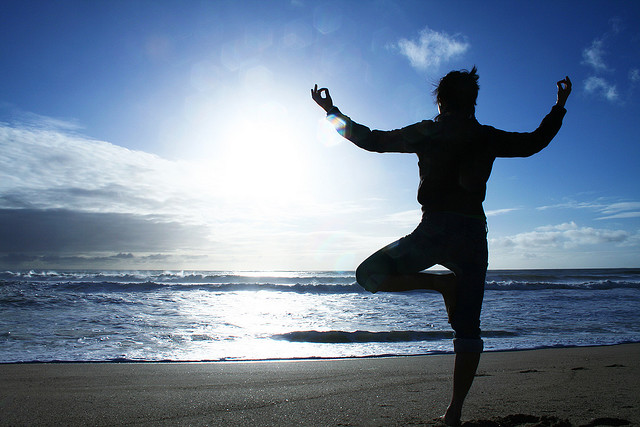
Q: Collect one image where the photographer has placed the main subject off center and retained a sense of balance and one image where the photographer has placed the main subject off center and created a sense of imbalance. Discuss the possible intentions of the photographer in creating each image. Create four images, placing the focal point and/or visual weight in different areas of the frame. Discuss whether each image is balanced.

I tried to create horizontal visual balance in this photo. The mountains and highway overpass in the top half of the photo balance out the rock and wood fence in the bottom half. Leading lines in also present in the picture.
Q: Collect one image where the photographer has placed the main subject off center and retained a sense of balance and one image where the photographer has placed the main subject off center and created a sense of imbalance. Discuss the possible intentions of the photographer in creating each image. Create four images, placing the focal point and/or visual weight in different areas of the frame. Discuss whether each image is balanced.
,

http://tinybuddha.com/blog/9-tips-to-create-a-balanced-life/
In this photo, the photographer has placed the subject (the person doing yoga) off to the right, but has still maintained a sense of balance. The picture is still balanced because the ocean and the sun are just as interesting as the person, and draws your eye just as much.

Photo by: Jule Berlin
This photo is not balanced, however because the subject (the lone tree) is overpowered by the gold grass, and the tree is not immediately noticed.
This is one of the photos I took in Payson, AZ. I tried making it balanced by putting two subjects (the trail post and my sister) on opposite sides of the frame.
With this image, I tried to put the visual interest on the in-focus rock on the right side, so that someone might not initially notice the girl peeking out from the tunnel behind it.
In this photo I tried to place visual interest in different areas of the frame. I put two cacti in the left side of the frame, however it is the bright sun in the right side of the frame that catches your attention first.
Thursday, August 22, 2013
Frame and Composition: Activity 3
Frame and Composition: Activity 3
Q: Find two photos that show rule of thirds composition and two that don't.

Q: Find two photos that show rule of thirds composition and two that don't.
http://www.empowernetwork.com/jennempowered/blog/cash-flow-rule-of-thirds/
This photo shows rule of thirds because the ant carrying the cookies is in the right 2/3 quadrant of the photo.

http://marcis95.blogspot.com/2012/11/composition-rules-of-photography.html
This picture also shows rule of thirds because in all the empty blue background, the tree is located in the right third of the photo.
http://digital-photography-school.com/forum/archived-assignments/138494
assignment-break-rule-thirds-nov-3-17-a.html
assignment-break-rule-thirds-nov-3-17-a.html
This photo doesn't show rule of thirds because if lines dividing the photo into 9 even square sections were drawn, the leaf (subject of the photo) would be in the center, not in one of the thirds sections.
Wednesday, August 21, 2013
Frame and Composition: Activity 2
Frame and Composition: Activity 2
Q. What does John Szarkowski mean when he says that photographers are quoting ‘out of context’ when they make photographic pictures?
Q. The frame often ‘dissects familiar forms’. At the end of the last century photography was having a major impact on Art. Impressionist artists such as Degas were influenced by what they saw. Look at these examples of Degas work, which clearly shows the influence of Photography, and explain why the public might have been shocked to see such paintings.
1. When Szarkowski says that photographers are quoting 'out of context' he means that what a photographer is basically doing is providing a picture without any other information about the photo or the settings it was taken under.
2. The public might have been shocked to see these paintings by Degas that were influenced by photography because in that time paintings usually had the subject in the center while in this painting the ballerinas are the not center of the photo, their position in the painting makes it more interesting.
Frame and Composition: Activity 1
Frame and Composition: Activity 1
Q: Look through assorted photographic websites and observe how many photographers have moved in very close to their subjects. By employing this technique the photographer is said to ‘fill the frame’ and make their photographs more dramatic. Find two examples of how photographers seek simple backgrounds to remove unwanted detail and to help keep the emphasis or ‘focal point’ on the subject. Attach two images you find to your reply to this discussion.
 http://photoinf.com/General/KODAK/guidelines_for_better_photographic_composition_simplicity.html
In the photo on the right, the photographer not only zoomed in on the seagull enough to fill the frame, but also eliminated the cluttered background.
Subscribe to:
Posts (Atom)


