Friday, August 29, 2014

Unit 3: Blog Entry 2

Unit 3: Blog Entry 2 

People:


In this photo, the model is positioned in the right two thirds of the photo, adding a more stylistic touch to the picture. The colors of the background also compliment the models, hair, eyes, and top. 

(Source: Michelle Moore Photography)


This time, the girl is positioned in the left side of the photo, but it is still rule of thirds composition. Again, although she is not centered in the photo, she is still clearly the only subject, and the background space does not distract from her being the focal point of the image. 


(Source: Karen Walrond Photography)


This picture is different from the others, because it features two models or focus points, but still has enough space in the left portion to qualify it as a rule of thirds photo. The beautiful backdrop compliments, but does not compete with the girls.


(Source: Sarah Jordan Photography)


Places:

Although this picture is hard to recognize as being rule of thirds composition; it still is because the slight increase of the mountain or tree formation in the background  slopes up in the left third of the page, being the only changing element in the photo. 


(Source: http://theartofmyart.blogspot.com)


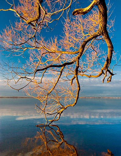
This is a more traditional composition, featuring a tree in the right third of the page; clearly the most dominating element in the picture.


(Source: http://theartofmyart.blogspot.com)


This rule of thirds photo also features a tree in a mostly spacious landscape, clearly demonstrating rule of thirds. 


(Source: http://dslrimagery.blogspot.com/2010/09/photographic-composition-balance-and.html)


Things:


The lighthouse in this photo is located in the right section of the frame, and therefore qualifies as rule of thirds. The contrast colors in this photo also make it beautiful and unique.


(Source: http://www.photographymad.com/pages/view/10-top-photography-composition-rules)


This incredibly simple photo of a bonsai tree against a bopping brown background is made interesting by its rule of thirds composition. 


(Source: http://gabrriellehudson.wordpress.com/2013/06/28/280613-storyboarding-and-rule-of-thirds/)


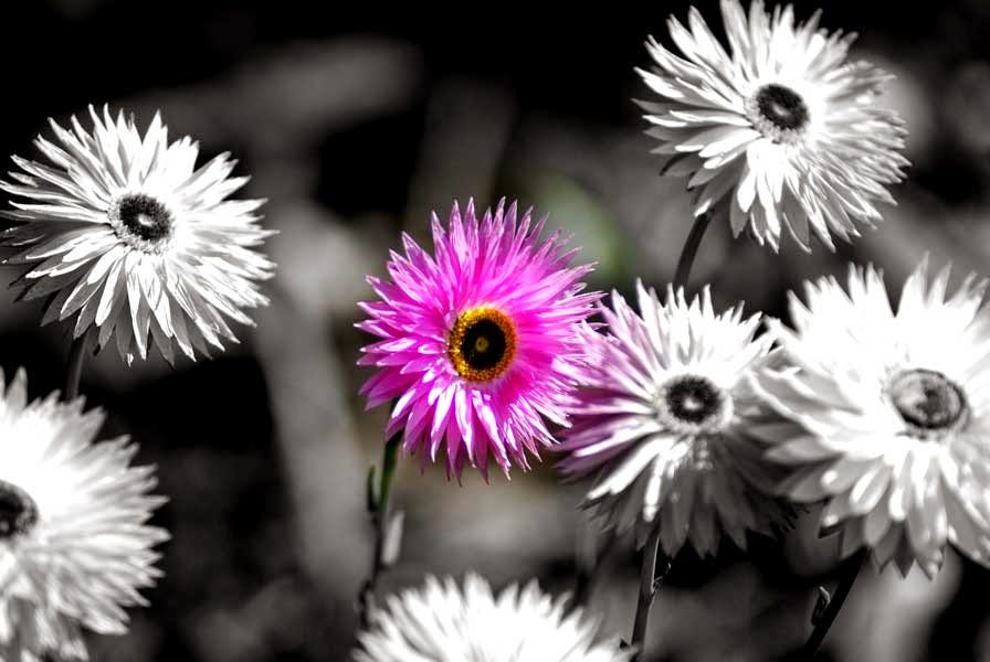
This picture is more questionably rule of thirds, because the flower looks almost centered in the image, however if you look closely you can see it in more shifted to the left, in the lower left two thirds quadrant, and none of the petals fall into the right third section.


(Source: http://richard.rathe.org/wp-content/uploads/2010/04/flower-rule-of-thirds.jpg)


Tuesday, August 26, 2014

Unit 2: Blog Entry 1

Unit 2: Blog Entry 1

Principles:


1. BalanceAs a basic principle of art (specifically of design), the definition of balance refers to the ways in which the elements (lines, shapes, colors, textures, etc.) of a piece are arranged. For a photo to show balance, all the elements in the photo must have equal importance and not outweigh the other.


Source: (http://photo.net/photo-of-the-week-discussion-forum/00DSYM)


2. PatternPatterns, both natural and man-made, bring a sense of visual rhythm and harmony to photographs that, like a series of repeating notes in a melody, capture the imagination. Patterns appear whenever strong graphic elements—lines, colors, shapes, or forms—repeat themselves. Pattern in a photo can be shown through repetition or lack of differing elements. 

Source: (http://chiaroscurophotoblog.blogspot.com/2010/06/patterns-and-textures.html)


3. RhythmRhythm is the repetition or alternation of elements, often with defined intervals between them.
Rhythm can create a sense of movement, and can establish pattern and texture. A photo with rhythm can appear as if it is about to come to life.

Source: (http://www.gardendesignexposed.com/rhythm_and_motion.html)

4. ContrastContrast is defined as the separation between the darkest and brightest areas of the image. Increase contrast and you increase the separation between dark and bright, making shadows darker and highlights brighter. The contrast in a photo is characterized by two competing elements almost in a battle of importance.

Source: (http://balla95.wordpress.com/2012/09/20/this-is-harmo/)


5. Unity- A principle of art, unity occurs when all of the elements of a piece combine to make a balanced, harmonious, complete whole. Unity in a photo shows all the elements working together visibly.

Source: (http://www.pxleyes.com/photography-picture/4b8d75fed90ac/Unity---.html)


6. Emphasis- A principle of art which occurs any time an element of a piece is given dominance by the artist.
For a photo to show contrast, one element must stand out far above the others. 

Source: (http://indiandigitalartists.com/photography-course-online/composition-rules-in-photography-2/)


7. Movement- the path the viewer’s eye takes through the artwork, often to a focal area. It can be directed
along lines, edges, shapes and color. Movement is closely tied to rhythm. Movement is a photo takes the viewer on a predesigned course for the eye to follow. 

Source: (https://sites.google.com/site/principlesofdesignsite/home/rhythm-movement)


Elements: 


1. Line- lines within an image that leads the eye to another point in the image, or occasionally, out of the image. This could include rule of thirds composition or lines in the image that guide the viewers eyes.
Source: (http://digital-photography-school.com/rule-of-thirds/)


2. Shape- Shape is a two-dimensional element basic to picture composition and is usually the first means by which a viewer identifies an object within the picture. Shape can be formed using elements in the photo or lack thereof.

Source: (http://mackenzienmurphy.weebly.com/14/post/2012/10/shape-photography-examples.html)


3. Form- Form is one of the seven elements of art. At its most basic, a form is a three-dimensional geometrical figure (i.e.: sphere, cube, cylinder, cone, etc.), as opposed to a shape, which is two-dimensional, or flat. This could be one element of the photo that dominates or gives an overall structure.

Source: (http://www.phonearena.com/news/Juxts-Lumia-920-Windows-Phone-Challenge-proves-mobile-photography-is-a-true-art-form-now_id44300)


4. Color- That aspect of things that is caused by differing qualities of the light reflected or emitted by them. Color is one of my favorite elements to work with in a photograph. 


Source: (Lauren Nicole Photography)


5. Space- An element of art, space refers to distances or areas around, between or within components of a piece. Space can be positive (white or light) or negative (black or dark), open or closedshallow or deep and two-dimensional or three-dimensional. Sometimes space isn't actually within a piece, but the illusion of it is. When taking pictures, I like to leave most of the space in my pictures empty. 

Source: (https://www.flickr.com/photos/leecullivan/122271605/)


6. Texture- Texture helps to emphasize the features and details in a photograph. By capturing "texture" of objects being photographed, you can create form. texture can make an incredibly simple photo unique.


Source: (http://www.wild-vision.com/home/jb_wild/texture/texture1.html)


7. Value- Level of brightness of pixel or color as defined in HSV (Hue Saturation Value) color space. I tend to prefer a lighter exposure to a darker one.

Source: (http://www.picturecorrect.com/tips/understanding-exposure-value-in-photography/)

Thursday, August 14, 2014

Unit 1: Blog Entry

In Photo 5-6, I want to take more of a variety of photos. Last year I mainly took pictures of nature or already interesting objects, but this year I want to try and find plain objects to photograph to bring out the beauty of them.

The camera I'm using this year is one of my own, but is the same model we used in class. Using it over the summer I got a better understanding of all the features of the camera, discovered the continuous shooting mode and became comfortable using different lenses.

One of my favorite pictures I took last year was of the Empire State building on a family trip to New York. It's not taken form a traditional angle or location but the surrounding buildings I think add to the effect of the photo. I also edited the photo to bring out some of the yellow and blue hues, showing a more colorful view of the traditionally gray city.

Tuesday, August 12, 2014

Summer Photos

Over the summer I went to Zion National Park in Utah and saw some of the most beautiful and powerful scenes I have ever seen. While on the 8 mile Observation Point hike I walked through a canyon with pools of water at the bottom, making it almost look like a mirror that the rock is reflected on.